
Interior Paint Colors That Last: How to Choose Ones That Won’t Date
Quick Answer: A color "lasts" in two ways: it stays true on the wall instead of fading, and it stays likable for years instead of looking dated. Choose quality paint with stable pigments for the first, and lean on tested neutrals or near-neutrals with undertones you have checked in your own light for the second. Test large swatches on several walls, look at them morning and night, and save bold color for spots you can repaint easily.
Most people pick a color from a two-inch chip under store lighting, love it, and regret it within a year. Sometimes the paint itself gives up, fading unevenly on a sunny wall. More often, the color never physically changed at all; it just stopped feeling right, or it revealed an undertone nobody saw on the chip. A color that lasts has to win on both fronts: it has to hold its pigment on the wall for years, and it has to keep looking good long after the trend that inspired it has moved on. Those are two different problems, and the choices that solve them are different too.
What "Lasting" Really Means for a Paint Color
There are two separate questions hiding inside the word "last," and confusing them is where a lot of repainting money goes.
The first is physical. Does the color on the wall stay the color you chose? Pigments fade at different rates when light hits them day after day, and cheaper paints hold less pigment in the first place. A wall can shift lighter, chalky, or slightly off-hue over a few years, especially where sun lands hardest.
The second is aesthetic. Does the color still feel current and livable years from now? A shade can be perfectly colorfast and still look tired because it was tied to a passing trend. Both kinds of "lasting" matter, and a good choice protects against both at once.
The two-sided test worth applying up front: Before committing, ask each candidate color two things: will the pigment hold up where the light is strongest in this room, and will I still be comfortable with this shade after several years of looking at it every day? A color that fails either test is a repaint waiting to happen.
Undertones: Why a "Gray" Reads Blue, Green, or Purple
Almost no wall color is truly neutral. What looks like a plain gray or greige on the chip is built from an undertone, a faint bias toward blue, green, purple, pink, or yellow. That undertone is invisible on a small chip but takes over once the color covers a whole wall and sits next to your floors, trim, and furniture.
This is the single biggest reason a color disappoints. A gray that looked warm and safe in the store turns cold and blue in a north-facing room. A soft beige goes distinctly pink next to a warm wood floor. The color did nothing wrong; its undertone simply showed up at full scale.
The practical move is to compare a color against its neighbors on the same strip. A gray placed beside its bluer and greener siblings reveals which way it leans. Holding a candidate next to a sheet of pure white paper also exposes the bias, because the white gives your eye a true reference the colored chip does not.
Undertones also decide whether colors coordinate. Warm-undertone whites and cool-undertone grays fight each other in the same sightline. Matching the undertone family across adjoining rooms is what makes a home feel intentional instead of patched together.
LRV: How Light or Dark a Color Feels in the Room
Light reflectance value, or LRV, is a number from 0 (absolute black) to 100 (pure white) that tells you how much light a color bounces back. Most paint brands print it in their fan decks and online color pages. It is one of the most useful numbers on the label and one of the least known.
LRV predicts how a color will behave in a real room better than the chip does. A color in the 60s or higher keeps a room feeling open and reflects daylight around the space. Drop into the 30s and 40s and the same hue reads moody and enveloping, swallowing light rather than spreading it. A dim room with one small window will feel very different painted at LRV 72 versus LRV 45, even if both colors are technically "greige."
Using LRV to match a color to a room: Rooms starved of natural light usually do better with higher-LRV colors that stretch what light there is. Rooms flooded with sun can carry lower-LRV, richer colors without feeling like a cave. Checking a candidate's LRV before you buy a sample tells you, in advance, whether the color will lift a room or weigh it down. It takes the guesswork out of "will this be too dark?"
Test Big, Test Everywhere, Test at Different Hours
A color is not one color. It changes with the light falling on it, and that light changes by the hour, by the direction the room faces, and by the bulbs you run at night. The same gray can look crisp at noon, warm at sunset, and slightly green under a cool LED. This is why a chip lies and a large sample tells the truth.
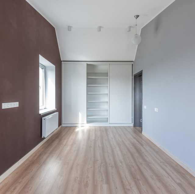
Paint a sample as large as you reasonably can; a couple of feet square is far more honest than a swatch card, and put it on more than one wall. A north wall and a south wall in the same room can read as two different colors because one gets cool indirect light and the other gets warm direct sun. Move the sample, or paint one on each wall, and watch how the color travels.
Paint a sample at least a couple of feet square on more than one wall, since a north wall and a south wall in the same room can read as two different colors. Then look at it in early morning, at midday, in late afternoon, and after dark with your lamps on before you commit, because a color you love at midday can turn flat and gray at night.
Then live with it across a full day. Look in early morning, at midday, in late afternoon, and after dark with your lamps on. A color you love at 2 p.m. can turn flat and gray at night, and better to learn that from a sample than from four painted walls. Some brands sell peel-and-stick paint samples that let you move a true-paint swatch from wall to wall without brushing anything on, which makes the day-long test easy.
Seasons shift this too. Winter light arrives lower and cooler while summer light is higher and warmer, so a color reads a little differently across the year. Testing across a couple of different days, rather than one afternoon, keeps you from being fooled by a single kind of light.
Timeless Neutrals Versus Trend Colors
The colors that stay likable for years tend to be neutrals and near-neutrals: soft whites, warm greiges, muted taupes, gentle sages, and quiet blue-grays. They read as calm backgrounds rather than statements, which is exactly why they do not wear out their welcome. They also let furniture, art, and light do the talking, so the room can change around them without a repaint.
Trend colors are the opposite bargain. A saturated color-of-the-year can feel fresh and specific right now and noticeably dated in a few years, the way certain bold kitchen colors instantly place a room in a particular decade. There is nothing wrong with color, but committing a whole room to this season's boldest shade is signing up to repaint sooner.
A trend color works like a bold jacket sitting next to a well-cut coat. The jacket is fun for a season; the coat works for a decade. You can absolutely own the jacket; you just would not build your whole wardrobe from it. The same logic keeps a repaint from becoming an every-few-years chore.
Where bold color is safe: An accent wall, a powder room, an inside-cabinet reveal, or the back of a bookcase are all places a strong color can live with low risk. These are small, contained, and quick to repaint, so a trend that fades from favor costs a single wall and an afternoon rather than a whole house. Bold color belongs where changing your mind is cheap.
Fade Resistance: Not All Pigments Age the Same
Two cans labeled the same color can hold that color for very different lengths of time, and the difference comes down to pigment. Some bright and deeply saturated colors lean on organic pigments that are more prone to fading, particularly strong reds, certain vivid blues, and hot pinks. Inorganic and earth-based pigments, the ones behind most neutrals and muted tones, tend to hold up far longer against light.
Quality also matters inside the can. Better paints carry more pigment and more durable binders, so the color stays truer and resists the chalky, washed-out look that cheaper paint can develop on a sunny wall. Manufacturers often market specific lines as fade-resistant, and while those claims can hold up, treat them as claims to verify for your color rather than a guarantee for every shade in the line.
Light exposure is the accelerant. The wall that gets hours of direct sun will always age faster than a shaded interior wall, which is one more reason to keep the boldest, most fade-prone colors out of the sunniest spots and to test how a strong color looks on the wall the sun actually hits.
Sheen Changes the Color You See
The same color in two different sheens does not look like the same color. A flat or matte finish scatters light and reads slightly softer, quieter, and often a touch lighter. A satin or semi-gloss finish reflects more light, which deepens and sharpens the color and makes any undertone more obvious.
So a color you tested in a matte sample can surprise you when it goes up in satin on the trim. If you are sampling, sample in the sheen you plan to use, or at least know that a shinier finish will pull the undertone forward and give the color more punch. Sheen is part of the color decision, not a separate one.
Making the Whole Home Flow
A home reads best when its colors feel related rather than random. The reliable way to get there is to build around one undertone family and vary the depth rather than the direction. Warm neutrals in the living room, a slightly deeper warm tone in an adjoining den, and a warm white on the shared trim will feel connected even though no two rooms match exactly.
Trim and ceilings are the thread that ties it together. Carrying one white through the trim across the main level gives the eye a consistent frame, so individual wall colors can differ from room to room without the house feeling chopped up. Open sightlines, where you can see two or three rooms at once, are where undertone clashes show most, so those are the walls to test against each other before you commit.
A quick word on safety while you paint: keep rooms ventilated with fresh air moving through, and if your home was built before 1978 and you will be sanding or scraping old paint, treat that old paint as possibly lead-based and look up safe handling before you disturb it.
Frequently Asked Questions
Well-applied quality interior paint on walls typically holds up for several years before it needs refreshing, with high-touch rooms like kitchens and hallways wearing sooner than bedrooms. Repaint timing is usually driven by scuffs, handprints, and wear rather than by the color fading, which is a slower and less visible process on interior walls than on sun-blasted exteriors.
No, and expecting it to is a common miscalculation. The direction each room faces changes how the color reads: north-facing rooms cast a cooler, bluer light that can make a warm color look muted, while south-facing rooms bathe the same color in warmer light that brings out its warmth. Even bulb color temperature, measured in Kelvin, shifts it, so a color under 2700K warm bulbs looks different than under 4000K cooler ones.
Not automatically. A dark color on all four walls can actually blur the room's boundaries and make corners recede, which can make a small room feel larger and more enveloping rather than boxed in. The trick that fails is painting only one dark wall in a tiny room, which chops the space and emphasizes how small it is. Depth used consistently reads better than a single dark accent in a cramped space.
Color drift is the gradual shift a painted surface undergoes as pigment ages and surface dirt accumulates, so the wall no longer matches a fresh coat of the exact same formula. This is why touch-ups from years ago can often show as a slightly different patch. For a true match later, a paint store can scan a chip of the existing wall with a spectrophotometer and mix to the aged color rather than the original recipe.
Usually not, and treating them as one color is a missed distinction. Ceilings are commonly painted a flat white a shade or two lighter or cooler than the trim so the plane reads clean and recedes overhead, while trim carries a slightly warmer or crisper white in a higher sheen to frame the room. Using the wall color at roughly 50 to 75 percent strength on the ceiling is another approach that ties the room together without a stark white overhead.
No screen shows paint color reliably. Every monitor and phone displays color differently depending on its calibration, brightness, and blue-light settings, and screens emit light while walls reflect it, so the two never match. Use online color pages and LRV numbers to narrow choices, but make the final decision from a physical sample painted in the actual room, never from a rendering on a device.
Bring your top colors to a crew that tests them on your walls first — get a finish you will still love years from now. Cesar's Painting serves Minneapolis, St. Paul, and Bloomington. Call (612) 203-5856.
