
Best Kitchen Cabinet Paint Colors That Boost Resale Value
You open the cabinet door and notice the honey-brown oak has started to darken around the pull, the finish worn thin from years of the same grip in the same spot. The grain runs everywhere — busy, dated, unmistakably 1990s.
If you're planning to sell, that cabinet color is doing more damage than the age of your appliances. Buyers make their kitchen assessment in about seven seconds. The cabinets eat up most of the visual field, so they dominate that first impression, whether you want them to or not. Color wrong, and buyers mentally add a line item to their offer. Color right, and the kitchen helps carry the sale.
Why buyers respond so strongly to cabinet color
When someone tours a house, they're running a constant mental calculation: does this room need work, or is it ready to move into? Bold or very personal cabinet colors interrupt that calculation — not because they're objectively bad, but because the buyer standing there doesn't have your countertop and your backsplash in their head. They have their own.
Neutral colors hand that calculation back to the buyer. White or soft gray cabinets say, "bring your stuff — this will work here." That's the practical reason neutrals dominate resale recommendations, and it holds across every market.
A HomeLight survey found over 60% of real estate agents recommend white, pale gray, or greige for kitchen cabinets when sellers want top dollar at closing. Zillow's Paint Color Analysis showed that homes with soft neutral kitchens sold for measurably more than comparable homes with other color schemes. Neither of those findings is an accident — they reflect what happens inside a buyer's head when the room doesn't create obstacles.
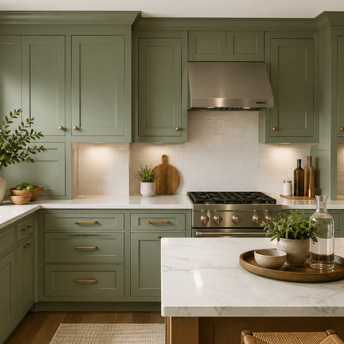
White: the default that actually earns its reputation
White cabinets hold the top spot for resale consistently. They reflect light, make a kitchen feel larger, and create visual separation between cabinets, countertops, and backsplash that lets each element read clearly. In a compact galley kitchen — which shows up constantly in Twin Cities homes built between the 1950s and 1970s — that light-reflecting quality matters. A 9x10 kitchen looks bigger in white than it does in almost anything else.
The white family is larger than a single chip makes it look. There's a real difference between a bright, blue-toned white and a creamy, warm white. Benjamin Moore Chantilly Lace OC-17 is among the crispest, coolest whites used in cabinet work — it reads sharp and clean in kitchens with strong north or east light. Sherwin-Williams Alabaster SW 7008 runs warmer, with a barely-there cream undertone that works better in kitchens where the flooring or backsplash already pulls toward yellow.
If you paint a warm kitchen with a cool white, the white reads blue under incandescent light. Buyers see it. Pick the wrong tone, and you've done the work without getting the credit.
Before settling on a white, brush two 8-inch samples directly on a cabinet door — not on foam board — and check them at 7 a.m., noon, and 7 p.m. Kitchen light shifts dramatically across the day, and the color that looks perfect at noon can read dingy or blue-toned under evening light.
Soft gray and greige: the safer choice for most Twin Cities kitchens
Light gray has moved from trend color to neutral staple over the past decade. It carries slightly more personality than white without polarizing buyers, and it handles a wider range of kitchen palettes because it sits between warm and cool rather than committing to either.
Greige — that gray-beige hybrid — works particularly well in older Twin Cities housing stock. The colonial and split-level homes built between 1955 and 1985 in Woodbury, Maplewood, and the eastern suburbs often have warm oak flooring, honey-colored tile, or cream-toned countertops. A true cool gray can fight all of that. Greige mediates it. It reads as modern to buyers who want modern and as warm to buyers who value warmth.
Sherwin-Williams Agreeable Gray SW 7029 and Benjamin Moore Pale Oak OC-20 both photograph well in listing photos — which matters because most buyers are filtering houses from a screen before they ever walk through the door. A cabinet color that photographs warm and inviting gets more showings. More showings raise the probability that the right buyer sees the kitchen.
Two-tone: when it works and when it doesn't
White uppers with a slightly darker lower cabinet or island have gone fully mainstream. Done right, it reads as designed rather than dated — the kitchen looks custom without being loud. White uppers paired with a soft sage green, muted navy, or warm charcoal on the lowers creates depth that a single-color cabinet run can't deliver.
Zillow data released in recent years pointed to a correlation between kitchens with green elements and higher sale prices — green kitchens, when executed in muted, sophisticated tones, are now tracking as a premium signal rather than a risk. That's a shift from five years ago.
The catch with two-tone: it only works when the kitchen has enough space and natural light to handle the contrast without feeling cluttered. A smaller, darker kitchen with two-tone cabinets can feel busy. And the line where the colors meet has to be precise — a sloppy transition reads as an amateur paint job rather than a design choice, which undercuts the whole effect.
Colors that cost you at closing
Warm earth tones from the early 2000s — terracotta, rust, saturated olive — read as renovation projects even when the rest of the kitchen is clean. They're not objectively worse colors. They are time-stamped. Buyers doing the math on what they'd change will add repainting to the list.
Dark espresso or near-black cabinets can work in large kitchens with good lighting and light countertops. In an average-sized space with modest windows, dark cabinets absorb light in a way that makes the kitchen feel half its actual size. During a showing, that spatial compression creates a physical discomfort buyers can't always name but react to immediately.
Saturated bold choices — cobalt blue, barn red, bright orange — narrow the buyer pool before the offer is written. Some buyers love them. Most don't know if they love them until they've lived in a space for six months, and that uncertainty translates directly into hesitation at closing.
Prep is the actual variable
Here's what the color conversation almost always skips: the color matters less than what goes under it.
Cabinets that were painted without proper degreasing, without scuff sanding, or without the right primer will show brush marks, chip at the hardware edges within a year, and peel where the finish coat never properly bonded. A kitchen with freshly painted cabinets that start chipping two months after listing is not a color problem. It's a prep problem — and it signals to buyers that the work wasn't done right.
Think of it like applying a bandage to a dirty wound. The bandage goes on. It holds for a moment. Then the surface underneath rejects it. Cabinet paint fails the same way when the preparation isn't there.
Oil-based alkyd and alkyd-hybrid cabinet-specific coatings cure to a harder film than standard latex wall paint. Benjamin Moore Advance and Sherwin-Williams Emerald Urethane Trim Enamel are the two most widely used cabinet-specific products in professional work — both are water-based hybrids that cure to alkyd-like hardness without the extended dry times of traditional oil. Kitchen cabinets get opened and closed hundreds of times a year, absorb grease vapor from cooking, and live through the humidity swings between a July that hits 80%+ and a January that bottoms out bone-dry. The coating has to hold through all of that, not just for a showing.
Hardware: the last ten feet
Cabinet color and hardware finish have to read as a deliberate pair. Warm whites and greige pair cleanly with brushed brass or warm bronze. Cool whites and grays work with brushed nickel, chrome, or matte black. Getting the color exactly right and leaving 1990s polished brass bar pulls on the doors is like solving 80% of the problem — the dated element still dominates the first impression.
Hardware is not a painting decision. But it's the part that completes the read, and it's worth the conversation before the paint goes on.
Frequently Asked Questions
White and soft gray consistently outperform other colors in resale data. HomeLight found that over 60% of real estate agents recommend white, pale gray, or greige for kitchen cabinets to get the widest buyer appeal. Zillow's Paint Color Analysis showed homes with soft neutral kitchen finishes sold for an average of $1,809 more than comparable homes. Both findings point to the same underlying logic: neutral colors reduce the mental friction buyers feel when deciding whether a kitchen needs work.
Yes. The National Association of Realtors' Remodeling Impact Report ranks kitchen improvements among the highest-ROI projects for sellers. Cabinet painting — typically $1,200 to $4,500 for a professional repaint on an average kitchen — delivers that return at a fraction of what cabinet replacement costs ($8,000 to $20,000 or more for mid-grade stock). A professionally done repaint in the right color can generate a return of 77% or better on the investment, according to Remodeling Magazine's Cost vs. Value analysis.
Both can work, but placement matters. Sage green in a muted, gray-toned form — not bright green — has become a legitimate resale color, particularly on islands or lower cabinets paired with white uppers. Zillow data has tracked green kitchen elements correlating with higher sale prices in recent years. Navy blue works on a lower cabinet or island when the uppers stay white or light gray. Painting all cabinets in either color on a smaller kitchen is risky — it reads personal rather than neutral.
Semi-gloss or satin. Both sheens clean more easily than eggshell or flat, and both resist moisture absorption from cooking vapor. Flat paint on kitchen cabinets chips and stains — it's the wrong product for a surface that gets touched hundreds of times a week. For cabinet-specific products like Benjamin Moore Advance or Sherwin-Williams Emerald Urethane, the satin or semi-gloss formulation is standard for good reason.
A professionally applied cabinet repaint using an alkyd-hybrid product over properly prepped surfaces typically holds cleanly for 8 to 12 years under normal use. The areas that wear fastest are around the hardware and where the door contacts the frame on closing — those spots often show wear at 5 to 7 years and can be spot-touched without a full repaint.
Before listing. Freshly painted cabinets in listing photos drive more showings, and the effect compounds when buyers walk in and the room matches the photos. The kitchen does its selling work from the listing images. By the time you're under contract, the buyers who filtered based on the kitchen have already made their decision — usually the day the listing went live.
Cesar's Painting handles cabinet painting and refinishing across Woodbury, Maplewood, St. Paul, Minneapolis, Bloomington, and the Twin Cities metro. Every cabinet repaint starts with full prep — degreasing, scuff sanding, and priming — before any topcoat goes on. Call (651) 650-4747 to schedule a free estimate.